This project looks at the “personality” and communication style of presidential campaign commercials. The data comes from a collection of screenshots taken from 20 Biden ads and 20 Trump ads during the 2020 election.
The focus of the analysis is on color intensity, using ImageJ tools like average intensity (shows how bright or dark each screenshot is overall), standard deviation (shows how much the brightness changes within one image), and summed slices (adds all the images together to show which colors or areas appear the most across the whole ad) to compare how visuals were used across both campaigns.
Data Source: Museum of Moving Images
Program Used: ImageJ
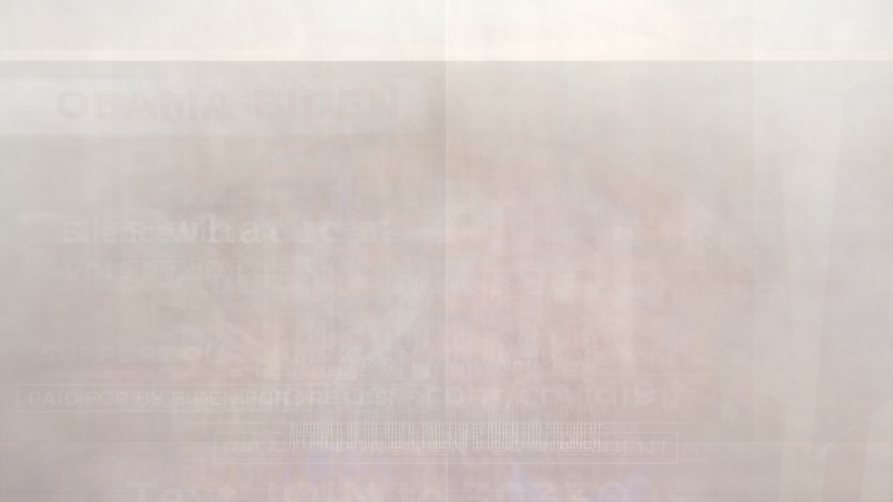
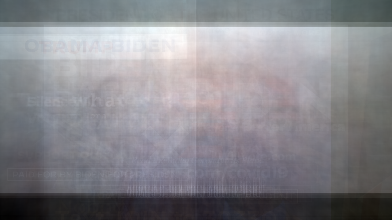
Biden 2020 presidential commercials
1. Colors are desaturated and muted.
2. Biden's name is less prevalent compare to Trump.
3. Appears more people-oriented, i.e., Biden's presence is not obvious.

Average Intensity
Standard Deviation
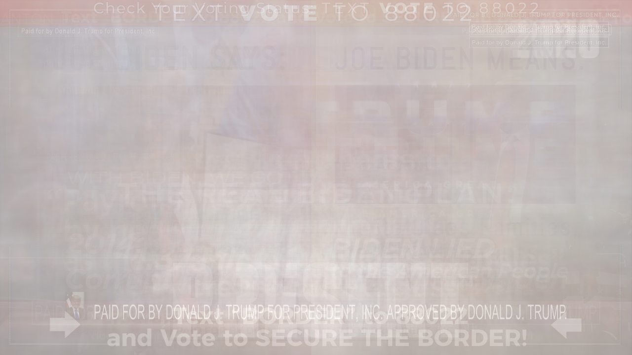
Summed Frames
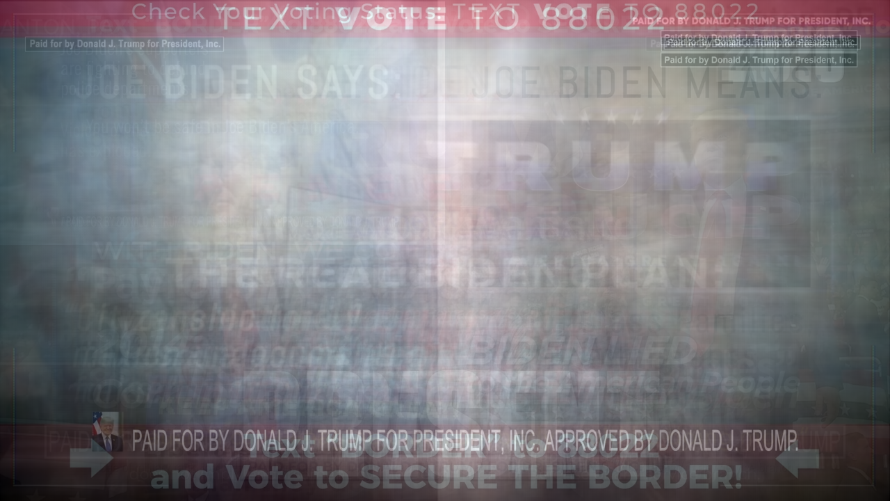
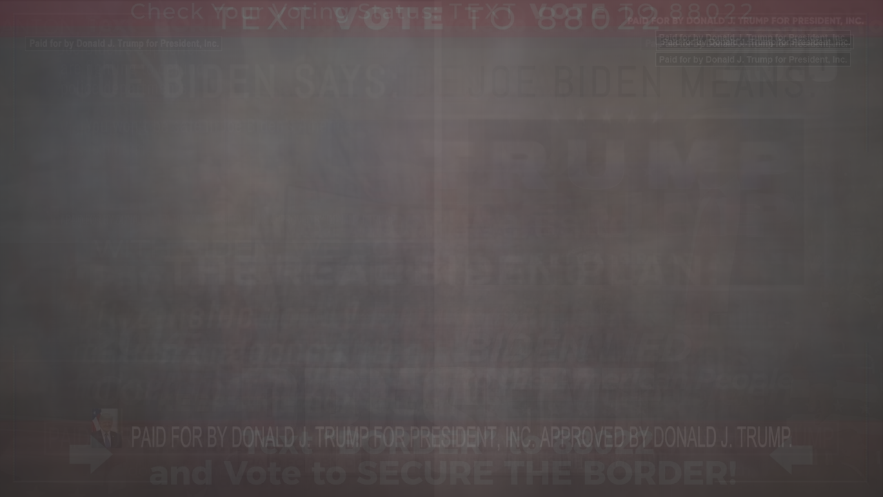
Trump 2020 Presidential Commercials
1. Prompts a call-to-action.
2. Words are emphasized and used to draw in the viewer.
3. Red is a strong color throughout; however, the colors are more of a darker tone.
4. It's easy to make out the word "Trump" and his "presence."
Average Intensity
Standard Deviation